Birdr App
Birdr is a mobile app concept that unites identification, journaling, and community features into one seamless experience.
Birdwatchers today juggle multiple tools: one for IDs, another for logs, and forums for sharing. Birdr solves this by providing an integrated, intuitive platform for everyone from casual backyard birders to expert ornithologists.
Overview
I was the sole UX designer for this project. I was in charge of the entire experience from research, strategy, vision, prototyping, and delivery of the app.
My Role
Defining the Problem
Early exploratory research confirmed what we suspected: the birding experience is fragmented. While apps like Merlin and eBird serve specific purposes (identification or logging, respectively), they lack the educational and social dimensions birders crave.
This insight reframed our design problem. Rather than simply automating identification, Birdr needed to teach, connect, and empower, helping users grow as observers while capturing the joy and narrative of their encounters.


Research & Discovery
I began with a Typeform survey to understand broad habits and frustrations within the birding community. From there, I conducted in-depth interviews with birders of varying experience levels. These conversations uncovered key needs:
Educational context: Users wanted to learn distinguishing traits, not just receive a name.
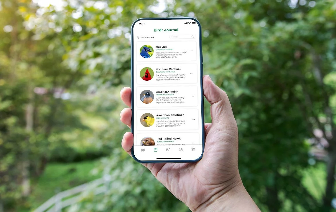
Richer journaling: Sightings weren’t just checklists, they were stories tied to weather, behavior, and emotion.
Structured community feedback: Likes and comments felt too shallow; mentorship was missing.
Offline functionality: Connectivity gaps in remote locations made this a non-negotiable.
A heuristic evaluation of existing apps using Nielsen’s heuristics highlighted gaps in feedback, error prevention, and visual consistency, shaping our early UI principles.
“I still rely on field guides because I want to understand why a bird is identified a certain way”
— Birdr Interviewee


Design Approach
My design process started with sketching and low-fidelity wireframes, refining information architecture and interaction patterns through several iterations.
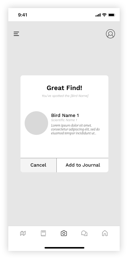
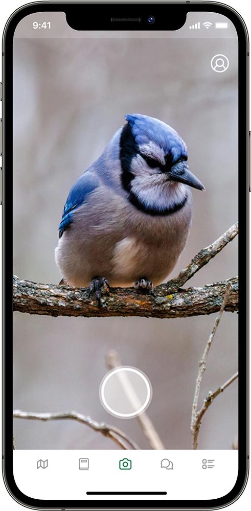
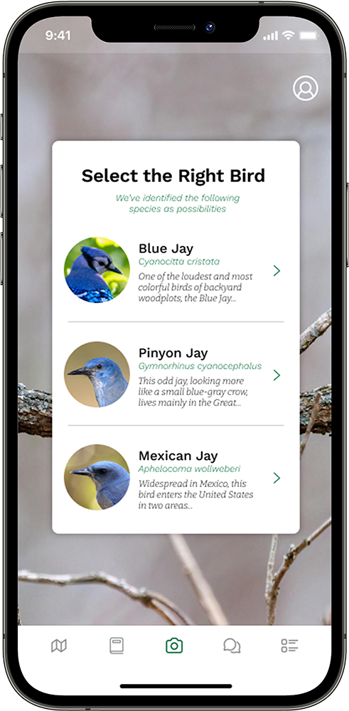
Core tasks supported in the prototype included:
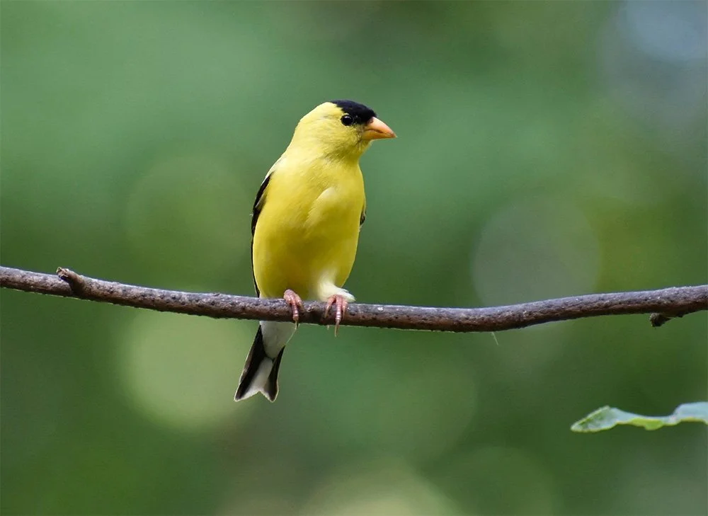
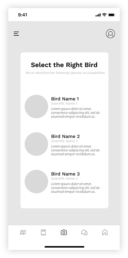
Photographing and identifying birds via AI
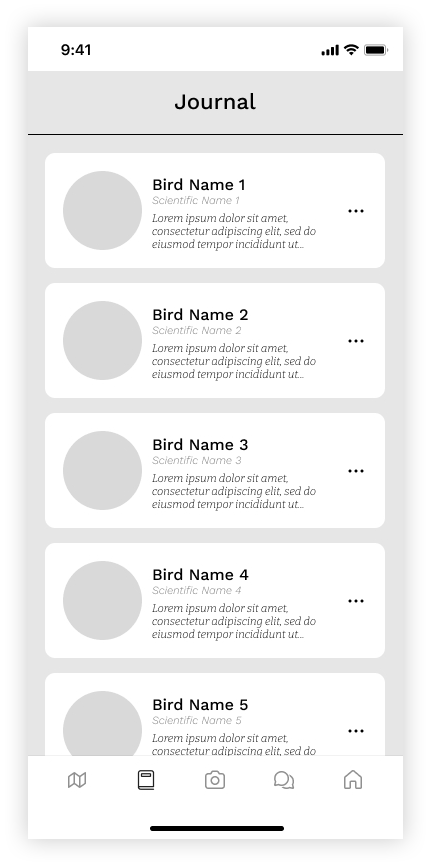
Logging sightings with automatic time and location tagging
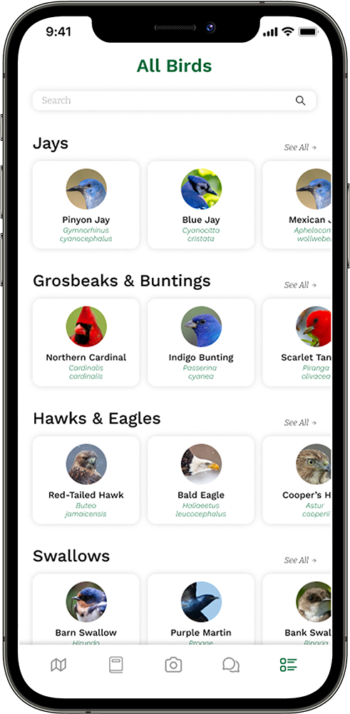
Exploring detailed bird profiles and habitats
Sharing photos and posts with the community
Throughout, I prioritized clarity and hierarchy, ensuring users always knew where they were and what actions were available.


Usability Testing
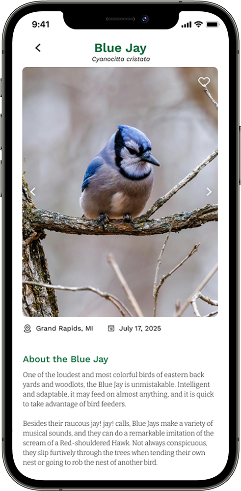
To test intuitiveness and clarity, I conducted a moderated usability test with three new users unfamiliar with birding apps. Participants completed four structured tasks ranging from learning about a Blue Jay’s habitat to setting a favorite photo.
3 out of 4 tasks were completed successfully.
Navigation was described as “friendly” and “approachable.”
Confusion arose when trying to set a favorite photo, as users conflated “like” with “set as profile.”
These findings led to actionable refinements:
Introduce clearer icon labels and tooltips.
Separate “like” and “set as profile” interactions.
Provide immediate visual confirmation for user actions.
Improve wayfinding cues for key workflows.
Even with prototype limitations, users described the app as “simple and calming,” a tone that matched the intended emotional experience.
Establishing a Visual Identity
Between the low-fidelity and high-fidelity phases, I focused on defining Birdr’s visual and brand language. The goal was to create a look and feel that reflected both the wonder of nature and the credibility of science.
The palette centered on a rich, natural green, evoking trust, growth, and a connection to the environment. It was supported by neutral grays and whites to maintain readability and balance. Typography played a key role in expressing Birdr’s dual personality, pairing a clean & friendly sans-serif for interface text with a sharp, academic slab-serif for headlines.
The resulting aesthetic conveyed both friendliness and Academic Rigor: modern enough for casual users, yet sophisticated enough for those seeking deeper knowledge. This identity became a guiding framework for layout, iconography, and motion design in the next phase.


Bringing It to Life
With branding established and structural testing complete, I moved into the high-fidelity design phase, refining the prototype into a polished and realistic app experience. Visual hierarchy, contrast, and spacing were carefully tuned to enhance readability outdoors, a key context for birders using the app in the field.
The result was a cohesive, visually rich prototype that captured the feel of a professional product for birding hobbyists to document and share their experiences.
This phase not only unified the research and visual design efforts but also served as a proof of concept, demonstrating how strategic branding, user-centered research, and iterative testing can come together to create a product that’s both delightful and deeply functional.