
SaaS Website Research & Design
Overview
UX research and design for a conversion-focused B2B software website, aimed at improving how users discover, evaluate, and engage with the product. The goal was to create a digital experience that not only looked cohesive but guided visitors through a clear, intuitive journey toward conversion.
My Role
I operated as sole researcher and designer for this project through all of its phases, including personas, user flows & journeys, and visual design.
Research & Discovery
The process began with stakeholder interviews across marketing and product teams to understand audience needs and current pain points. These sessions revealed a key insight: the existing site didn’t allow users to self-educate effectively before contacting Sales. That finding shaped the foundation for the redesign strategy.
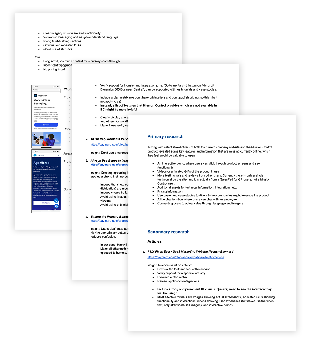
To supplement these insights, I conducted competitive and industry research, reviewing high-performing B2B SaaS websites to identify best practices in conversion rate optimization (CRO). Comparing the product’s messaging and UX patterns against competitors uncovered opportunities to strengthen differentiation, improve content hierarchy, and increase clarity across the user journey.

Personas
Using insights from the company’s ideal customer profile (ICP), I created six detailed personas representing distinct user segments ranging from executive decision-makers to operations and technical leads.
Each persona captured motivations, challenges, and behavioral drivers, helping to align both content strategy and interface design with authentic user goals. These personas served as a north star for maintaining empathy and focus throughout the design process.


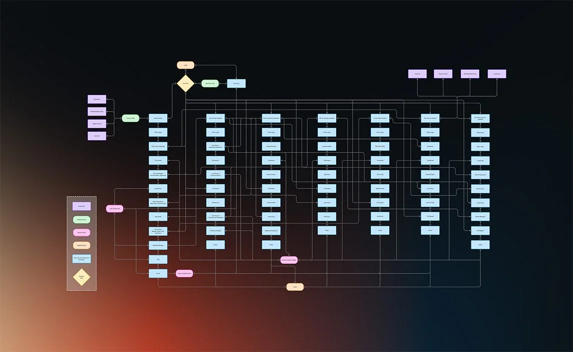
User Flow
I developed user flow diagrams to map how visitors would navigate the site, from initial awareness through to form submission or demo request. This clarified the structure, revealed gaps in navigation, and informed how content and calls to action could guide users toward meaningful outcomes with minimal friction.
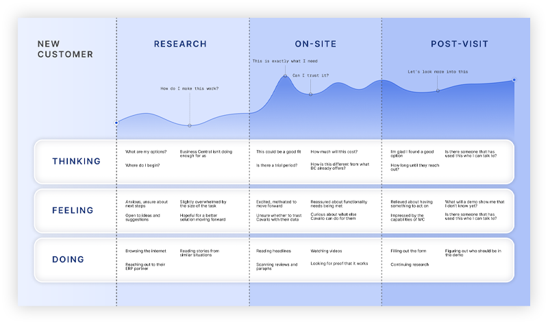
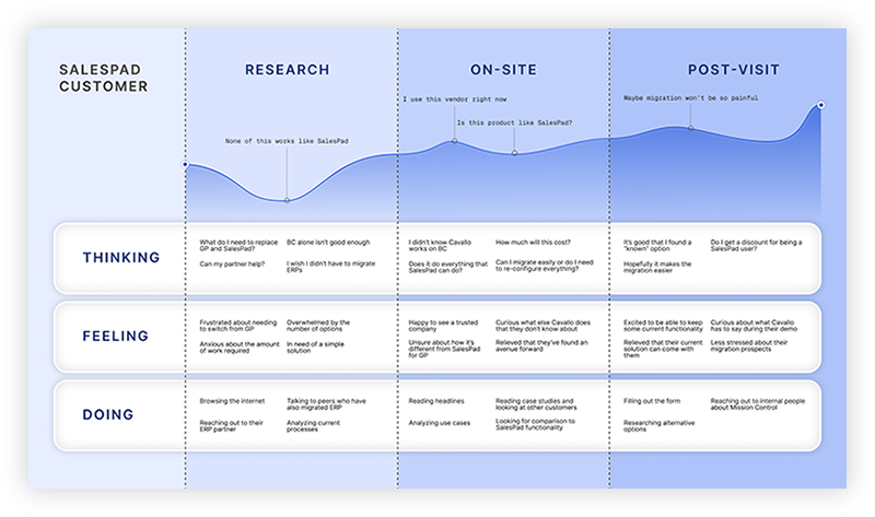
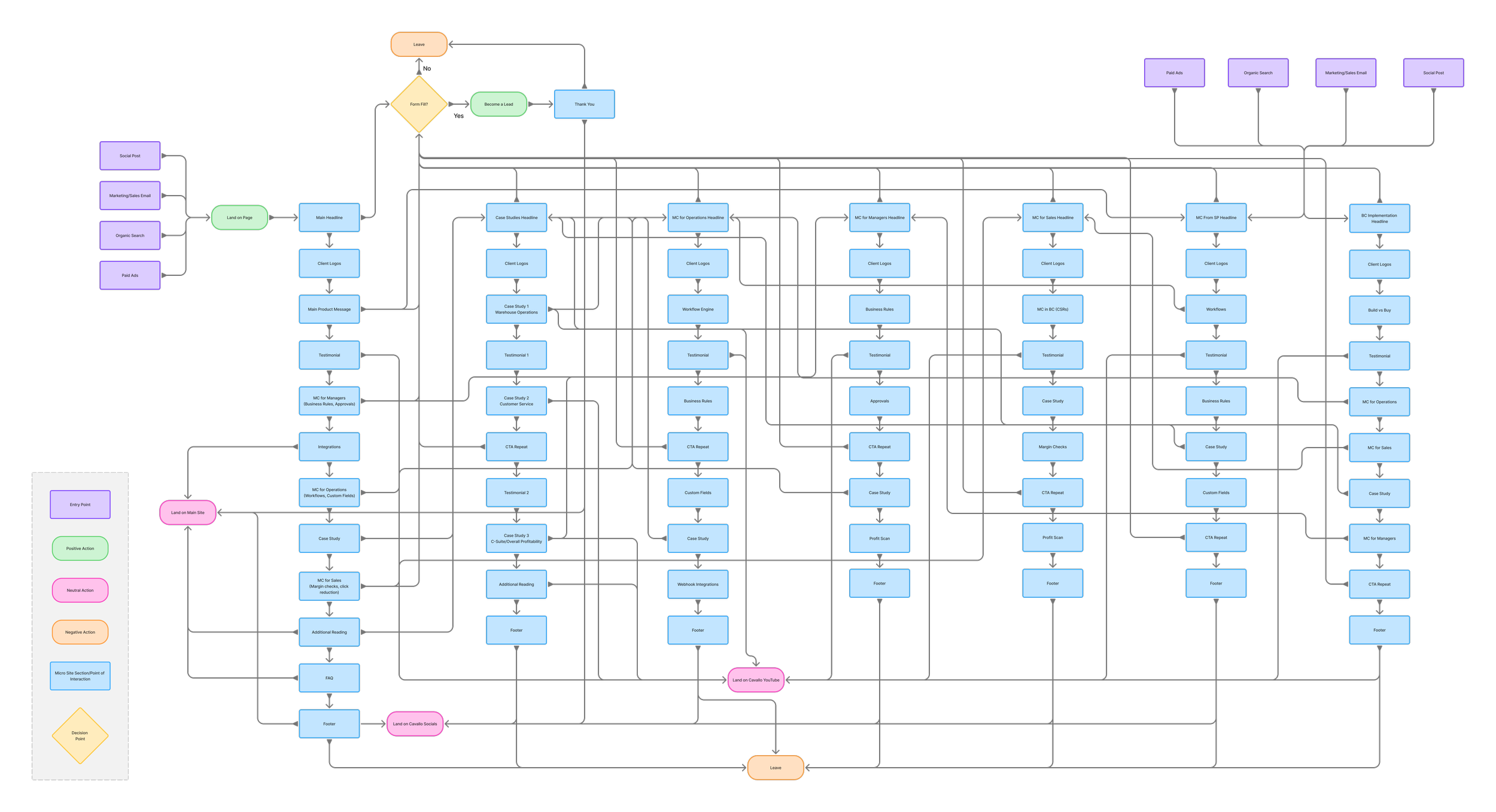
User Journeys
I developed user flow diagrams to map how visitors would navigate the site—from initial awareness through to form submission or demo request. This clarified the structure, revealed gaps in navigation, and informed how content and calls to action could guide users toward meaningful outcomes with minimal friction.

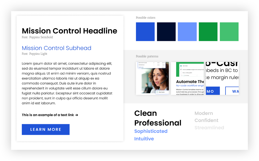

Mood Board & Style Tiles
Finally, I explored the visual direction of the website through mood boards and style tiles, balancing clarity with a sense of sophistication. Drawing inspiration from modern SaaS brands and high-performing websites, I established a visual system that communicated trust, energy, and innovation while remaining consistent with existing brand foundations